The dialogs on your website should probably not be taller than 539px
And the reason for that is the iPhone SE, specifically its 2nd (2020) and 3rd (2022) generations. These two iPhone models, which are still actively supported by Apple and run the latest version of iOS, have probably the smallest viewport height of all smartphones in use today: 549px in Safari, and only 539px in Firefox (due to Firefox’s taller address bar).
Dialogs (dialog boxes) on websites that are taller than that won’t fit into the viewport on iPhone SE. In the worst case, the user may not be able to use the website at all. Exactly that happened to Z Centar (a new shopping center in Zagreb, Croatia):
- The website shows a newsletter sign-up dialog on page load
- The dialog’s close button is located in the upper right corner of the dialog
- The close button is not visible in the viewport because the dialog is too tall
- The dialog cannot be scrolled at all, so the close button is unreachable
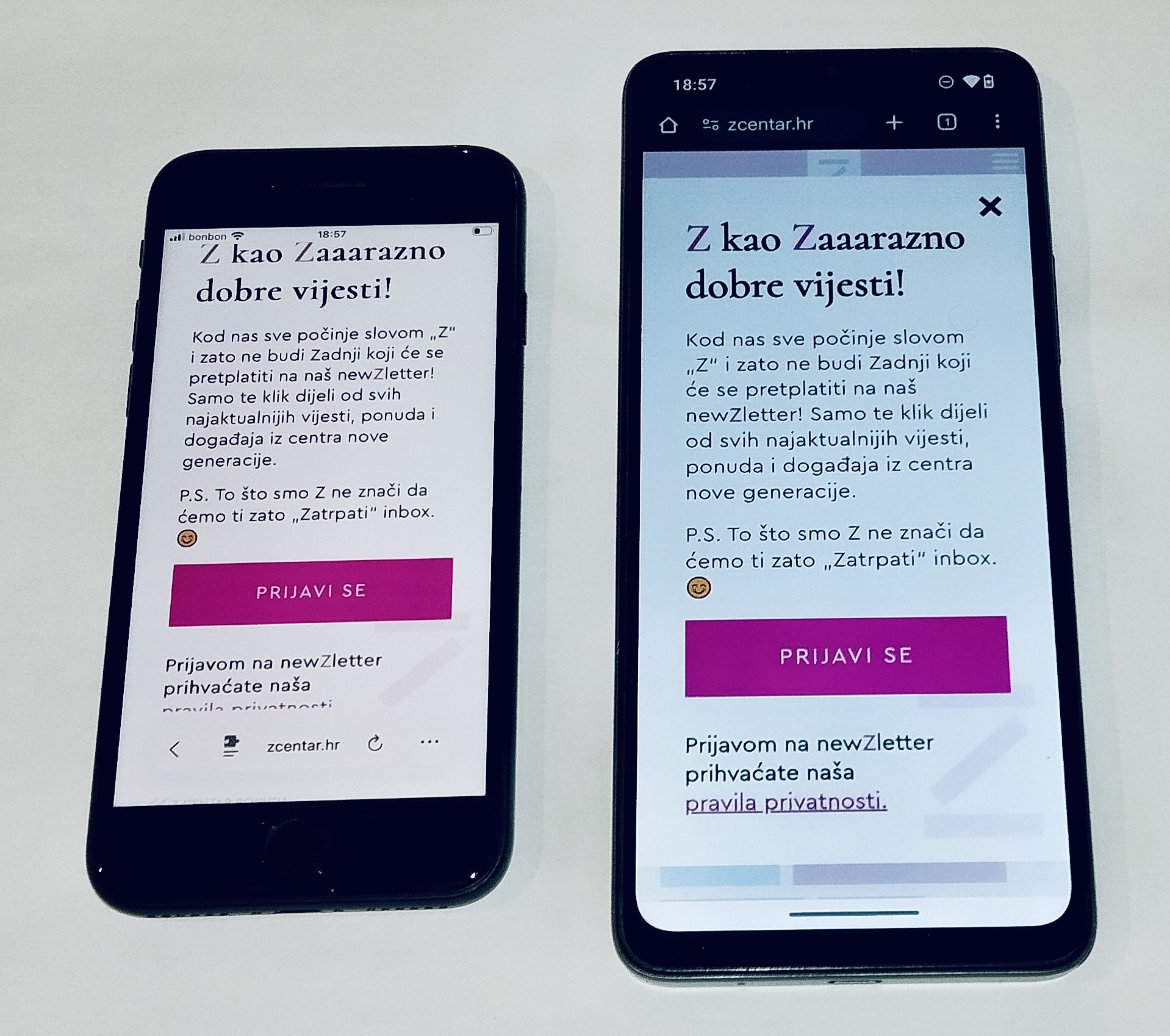
I opened this website on my iPhone SE because I needed to check the closing times of a bookstore in Z Centar. I could not get past the dialog in my preferred browser (Firefox). That website was effectively down for me. Signing up to the newsletter just to get rid of the dialog does not help either, in case you were wondering. I was at home, so I could access the website from one of my other devices, but if I were out, I would have to think of another way to access the information that I needed, and I’m not sure if I would have had the patience to do that. (I later remembered that Safari has a “Hide distracting items” feature that could have helped me get rid of the dialog.)
It’s worth mentioning that the website would not have had this problem if it used the standard <dialog> element, which provides built-in scrolling functionality if its contents are taller than the viewport. So to the devs of Z Centar, if you need a hotfix, replace the <div> with <dialog> and use the showModal method to show the dialog.
Device modes in browser devtools have an “iPhone SE” preset, but those tools have a critical flaw (IMO). They set the viewport height to the full screen height of the iPhone SE, but on a real iPhone SE, the actual viewport height is of course smaller because the iOS status bar and the browser’s address bar take up some space. So if you test your dialog or similar content in the devtools preset and it fits, it might not fit when I open your website on my iPhone SE. For that reason, you might want to manually check the height of the content and make sure that it’s not taller than 539 pixels.